Choosing the best email font might seem simple, but it can make a huge difference in how your message is received. The right font grabs attention, makes your email easy to read, and builds trust with your audience.
If you want your emails to stand out and get results, you need to pick a font that works for you and your readers. Keep reading to discover which fonts will boost your email’s impact and keep your readers hooked from start to finish.
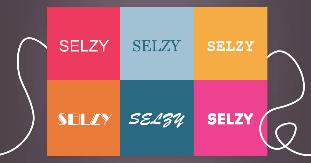
Credit: selzy.com
Choosing The Right Font
Choosing the right font for your email is important. It affects how easy your message is to read. The font style sets the tone and mood of your email. Picking a good font helps keep your readers interested. It also makes your email look clean and professional.
Serif Vs Sans-serif Fonts
Serif fonts have small lines at the ends of letters. They look classic and formal. These fonts work well for printed text but can be harder to read on screens. Sans-serif fonts do not have these lines. They look simple and modern. Most emails use sans-serif fonts for better readability on digital devices.
Font Size Matters
Font size affects how easy your email is to read. Too small fonts tire the eyes quickly. Too large fonts look unprofessional and can be overwhelming. A good font size is usually between 14 and 16 pixels. This size is clear on both phones and computers.
Using Web-safe Fonts
Web-safe fonts are fonts that work on almost all devices. They make sure your email looks the same for everyone. Common web-safe fonts include Arial, Verdana, and Times New Roman. Using these fonts avoids strange text displays and keeps your email clean and simple.
Fonts That Enhance Readability
Choosing the right font for emails matters a lot. Fonts that enhance readability make emails easier to read. Clear fonts keep readers engaged and reduce eye strain. Good font choices improve communication and create a better experience.
Popular Readable Fonts
Many people choose simple fonts for emails. Arial, Verdana, and Calibri are popular choices. These fonts have clear letter shapes and good spacing. They work well on screens of all sizes. Using common fonts also ensures emails display correctly everywhere.
Avoiding Overused Fonts
Some fonts appear in almost every email. Times New Roman and Comic Sans are examples. Overused fonts can make emails look dull or unprofessional. Choose fonts that feel fresh but still easy to read. Unique fonts help your message stand out without confusing readers.
Balancing Style And Clarity
Fonts must look nice but also stay clear. Script or decorative fonts look stylish but are hard to read in emails. Stick to simple, clean fonts with enough space between letters. This balance helps keep readers focused on your message. Clear fonts guide readers through your content smoothly.
Impact Of Font On Engagement
The font used in emails plays a vital role in how readers respond. It affects readability, emotion, and trust. Choosing the right font can boost engagement and encourage readers to act. Fonts help set the tone of your message and guide the reader’s eye. A good font makes emails easier to scan and understand. Poor font choices can make readers leave quickly. Small changes in font style impact how people feel about your email content.
How Fonts Influence Reader Behavior
Fonts affect how readers feel and behave. Simple fonts help readers focus on the message. Fancy fonts might distract or confuse. Some fonts feel formal, while others feel friendly. These feelings change how readers react. Easy-to-read fonts increase the chance readers finish the email. Fonts also guide readers to important parts. Bold or larger fonts highlight calls to action. Readers often trust emails with clear, neat fonts more.
Fonts That Encourage Action
Fonts that are clean and clear encourage readers to act. Sans-serif fonts like Arial and Helvetica work well. They look modern and are easy to read on screens. Fonts with good spacing help readers not feel crowded. Strong fonts draw attention to buttons and links. Avoid fonts that are too thin or too decorative. These fonts make it hard to read quickly. Action words in bold fonts get more clicks. The right font creates a smooth reading path to the goal.
Case Studies On Font Effectiveness
Several studies show how fonts impact email success. One study found emails with Arial had 10% higher open rates. Another test showed Times New Roman lowered click rates by 5%. A company increased sales by using Verdana in their emails. They saw readers stayed longer and clicked more links. Small font changes can change results a lot. Testing fonts with your audience helps find the best fit. Real data proves the power of font choice on engagement.

Credit: www.youtube.com
Customizing Fonts For Your Brand
Customizing fonts for your brand in emails helps create a strong identity. It makes your messages clear and memorable. Choosing the right font shows professionalism and builds trust. Fonts reflect your brand’s personality and values.
Picking a font that matches your brand style improves recognition. It also improves the reading experience for your audience. Consistent fonts make your emails look neat and polished. Custom fonts can set your emails apart from others.
Maintaining Brand Consistency
Use the same fonts across all your emails. This keeps your brand image steady and familiar. Consistency helps readers quickly recognize your emails. Avoid changing fonts too often. It can confuse your audience and dilute your brand.
Stick to your brand’s official fonts for headlines and body text. Use font sizes and colors that match your style guide. Keep spacing and alignment uniform. Brand consistency builds trust and professionalism.
Pairing Fonts For Email Design
Combine fonts that look good together but do not clash. Pair a simple font for the body with a bold font for headings. This creates contrast and guides the reader’s eye. Limit yourself to two or three fonts per email.
Choose fonts that are easy to read on screens. Avoid fancy or hard-to-read fonts. Test your font pairs on different devices. Good font pairing improves email flow and reader engagement.
Using Fonts To Convey Tone
Fonts express feelings and tone without words. A clean, modern font shows professionalism. A playful, rounded font feels friendly and casual. Match your font style to your message’s mood.
Formal emails need serious, simple fonts. Informal emails can use fun, creative fonts. Fonts help your readers feel the right emotion. They support your message and brand voice effectively.
Technical Tips For Email Fonts
Choosing the right font for your email is not just about style. Technical details affect how your email looks on different devices and apps. This section gives practical tips to make your email fonts work well everywhere.
Ensuring Cross-device Compatibility
Emails open on phones, tablets, and desktops. Each device can show fonts differently. Use common fonts like Arial, Verdana, or Georgia. These fonts appear correctly on most devices. Avoid rare fonts that may not display well. Test your emails on several devices before sending.
Fallback Fonts And Email Clients
Email apps handle fonts in different ways. Some apps do not support custom fonts. Set fallback fonts in your email code. If the main font fails, the fallback font shows instead. This keeps your email readable and neat. Choose fallback fonts similar to your main font for a consistent look.
Optimizing Load Times
Large font files slow down email loading. Use system fonts or web-safe fonts to avoid delays. Limit the number of fonts in one email. Smaller emails load faster and keep readers engaged. Fast load times improve user experience and reduce bounce rates.

Credit: www.cnvrtool.com
Conclusion
Choosing the best email font helps your message stand out clearly. Simple, clean fonts make reading easy and pleasant. Avoid fonts that look crowded or too fancy. Think about your audience and the tone you want to set. Consistency in font use builds trust and professionalism.
Small changes in font style can improve your email’s impact. Keep it readable on all devices for better engagement. A good font choice supports your message, not distracts from it. Take time to pick a font that fits your purpose well.